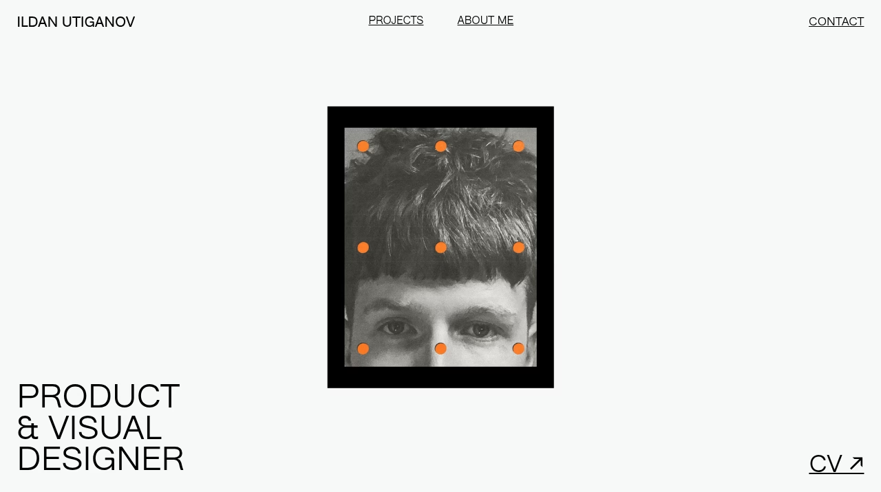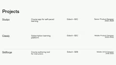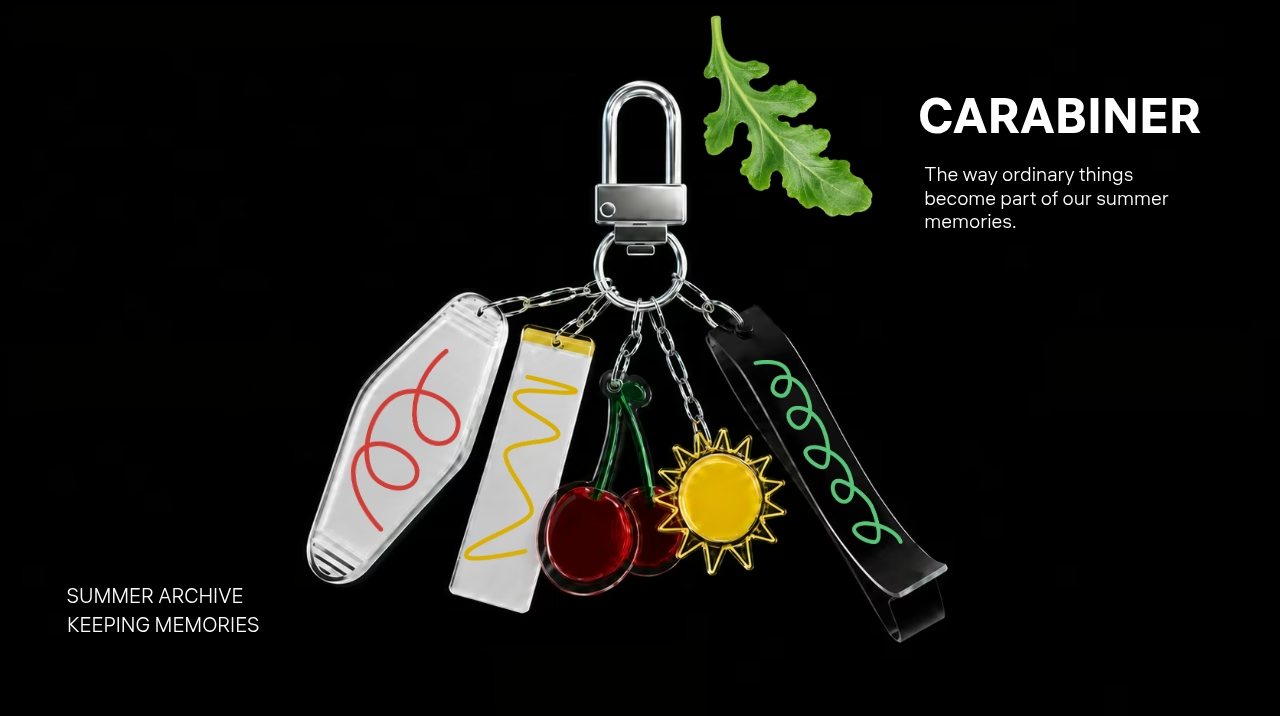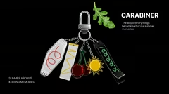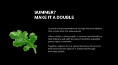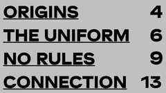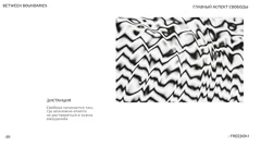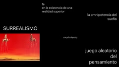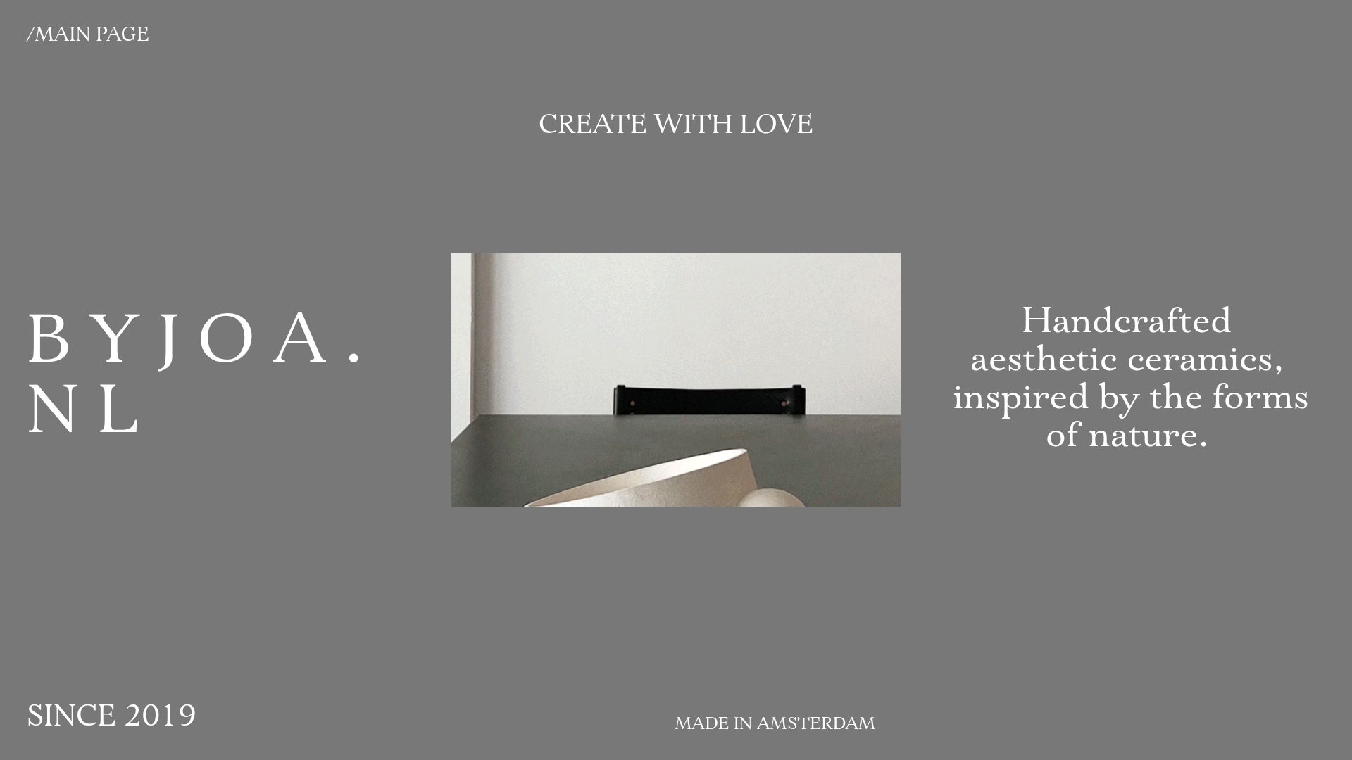









pastel color scheme introduction
soft tones for visual harmony
minimalistic design elements
clean layout with text blocks
space for charts and graphs
room for images and icons
simple yet elegant design
pastel palette for professional look
uncluttered slide structure
versatile content presentation

Pastel Color Presentation

10 slides

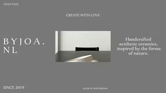
A template with pastel colors and minimalistic design for clear visualization of content.

View template

Tags

About the template

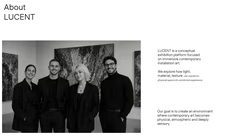
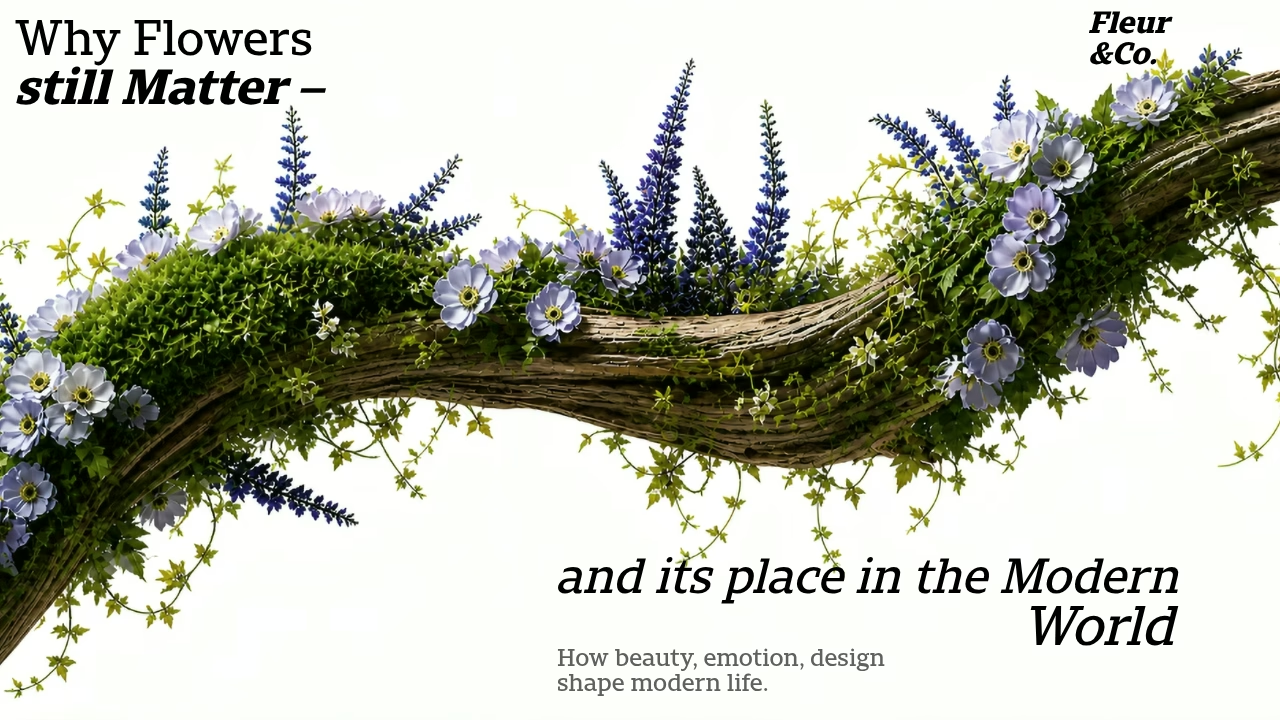
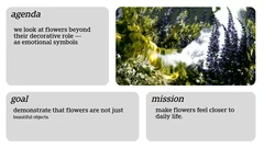
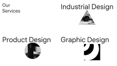
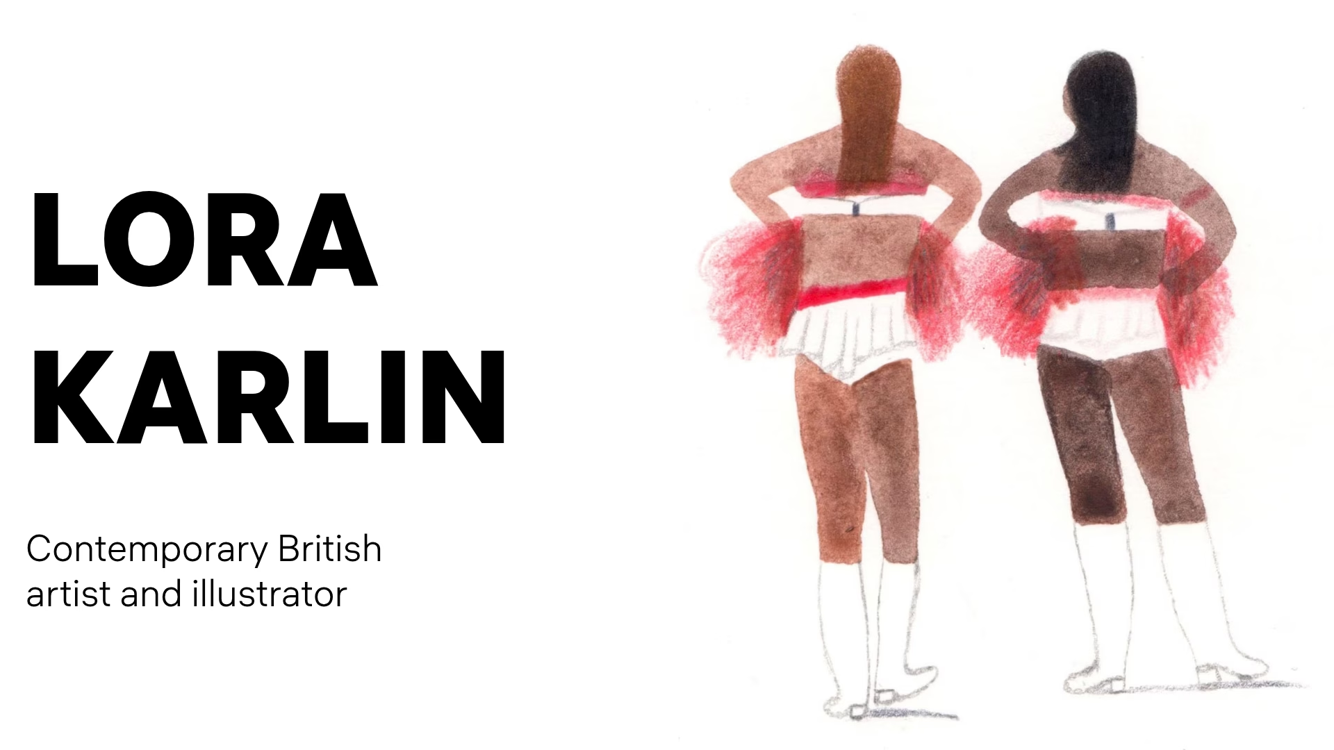
The template offers a set of slides with pastel colors and minimalistic design. Each slide includes text blocks, space for images, charts, and icons. The design helps to present information clearly and elegantly.

When to Use Pastel Colors

Pastel colors are good for presentations on lifestyle, wellness, and educational topics. Soft tones create a calming atmosphere and help maintain visual harmony. For business presentations, pastel colors can build trust with the audience while keeping the focus on the content.

Types of Content to Present

The template works well for several types of content. You can use it to demonstrate product features with an elegant touch. It’s suitable for course outlines and study guides in educational projects. Business reports and project summaries can benefit from the professional yet approachable look. Wellness and lifestyle topics, like mental health awareness or healthy living, fit well with the pastel color scheme. Creative portfolios and art exhibitions can use the template to highlight the aesthetic appeal of the work.

How to Make the Most of the Template

To preserve the clean look of the slides, keep the text short and focused. Choose high-quality images and icons that match the pastel colors. Add charts and graphs carefully to avoid clutter. Make sure the font colors contrast with the background for easy reading. Use the same design elements throughout the presentation to create a unified look.

Examples of Use Cases

The template is useful in different situations. For example, it can help launch a new product with a gentle and friendly image. Educational webinars and online courses can use it to create a calming atmosphere. In corporate training, the design can convey information professionally without being intrusive. Startups can present their ideas to investors in a sophisticated and memorable way. Event organizers may use the template for promotional materials that need to be both appealing and easy to understand.

FAQ

  • How can I make a presentation more engaging?

    Use visual elements, illustrations, charts, and concise bullet points. Add examples, stories, and animations if appropriate. The key is maintaining balance between text and visuals.

  • How do I choose a presentation template?

    The choice of template depends on the purpose and audience of the presentation. Business presentations require clean and professional templates, educational ones may benefit from more visual designs, and marketing presentations often use bold and dynamic layouts. The design should enhance clarity rather than distract from the content.

  • How many slides should a presentation have?
    An optimal range is 10 to 20 slides, but it depends on the topic and presentation format. The main goal is to avoid overload and maintain a logical flow.

  • How to use colors to highlight information?

    Use contrasting colors to emphasize key points. Avoid overloading slides with bright shades and maintain a consistent design style. Colors should aid understanding, not distract.

  • Where can I make a beautiful presentation for free?

    You can quickly create a beautiful and professional presentation in the Fokus online builder. Our service offers free access to designer templates, automatic color and font selection, allowing you to create impressive slides in minutes, even if you have no design experience.